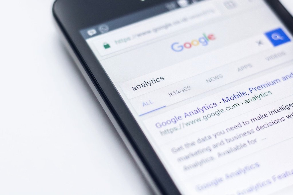
Mobile SEO is one of the most important factors to get right on a website.
Web users are consuming more content on their mobile devices and with search engines like Google providing Mobile-First indexing, it is essential that your site’s web content is optimized for mobile devices.
It is ideal to launch a mobile-friendly website. If you haven’t, we will share the different actions that you can implement to optimize your site for mobile devices, and improve your website’s SEO ranking.
Why should you care about mobile SEO?
The mobile consumer market is growing.
According to Statista, 1.45 billion smartphone units were shipped globally in 2018. [15]. In Q4 of 2018, Apple shipped over 50,000 mobile devices worldwide [4]
As more people start using and consuming content on mobile devices, people will use search engines to find and consume content.
Google owns and operates the Android market. In 2017, Google tweeted that they had over 2 billion active Android users per month.
Additionally, Apple identified the importance of rendering web content for mobile and lodged a patent back in 2009. [5]
IOS users are also likely to use Google mobile for their searches.
How can you improve the mobile SEO of your website?
You can implement the following steps, which will help improve the mobile SEO performance of your site’s content.
Check the mobile rendering of your website in Think with Google.
Put your website’s domain into ThinkWithGoogle.com and run a report to see how the site loads on a mobile device that is on the 4G network.
You will be able to get insights in a report, which will share recommended actions to improve the mobile speed and rendering of the page.
Check the mobile rendering of your website in Google’s Mobile-Friendly Tool.
The second step is to check the mobile rendering data at the page level in the Google Mobile-Friendly Tool.
The results will tell you if the web url is mobile-friendly and it will also share insights into the loading and rendering that the search robot will see.
You can identify loading or rendering errors and get them corrected.
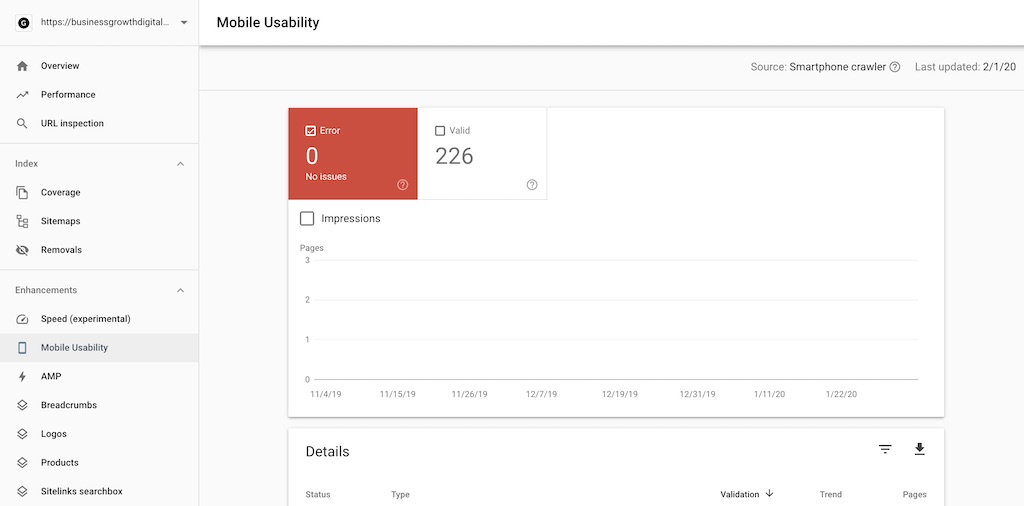
Check the mobile rendering of your website in the Google Search Console.
Thirdly, check the Google search console’s mobile usability report for any issues.
You can inspect the code and also get insights into any page loading issues that need to be addressed.
You can also see when Googlebot for Smartphone visited the website.
Optimise your website to load quickly on mobile devices.
You need to make sure that your web pages load in less than 2 seconds (less than 1 second is ideal). You can use the following steps to improve the page loading time for mobile devices.
Be aware of the mobile markets that you are targeting.
Mobile technology is at different stages around the world. Be aware of the markets that you plan to target and the mobile performance based on the devices and networks that they are on.
Mobile data networks range from 2G to 5G around the world. This will impact the page loading time on mobile devices.
Submit your site to ThinkWithGoogle.com and measure the performance against the available networks and target country regions.
Build a website with lightweight and mobile-responsive web pages.
Your website’s theme needs to built with good HTML that is light and fast loading.
A heavy and poorly built website will require “patchwork”, and your site will never be optimized for SEO the way that it needs to be.
The more simple HTML that is used to develop the site and its web pages, the better.
This should also see the consolidation of scripts or heavy media objects such as images, videos, audio file, apps, plugins, etc on the web page.
Make sure the theme that you develop or install is also mobile responsive.
You need your site to render in the correct dimensions when accessed on the different mobile devices.


Use a CDN
Make sure you have a CDN solution in place so that mobile users will be able to access your content quickly from their global location and also the network that they are using for their device.
There are quite a few providers, but you will need to choose a provider that suits your budget, content serving needs, and infrastructure setup.
A few that you can consider include:
- Amazon Lightsail
- Amazon S3
- Oracle (IAAS)
- Akamai
- Cloudfare
- MaxCDN
Serve a cached static HTML page from a CDN (Mobile cache)
If your website is static, use a CDN service that will allow you to store cached static pages from your site that can be loaded quickly from different global locations.
If your site is dynamic, identify the dynamic elements and assess which static pages can be cached and served via the CDN, whilst maintaining the dynamic solution on the CDN for relevant web pages.
This will help improve the page loading time of your web pages.
Configure this through your web host (ideally) or through customisations in your site’s CMS.
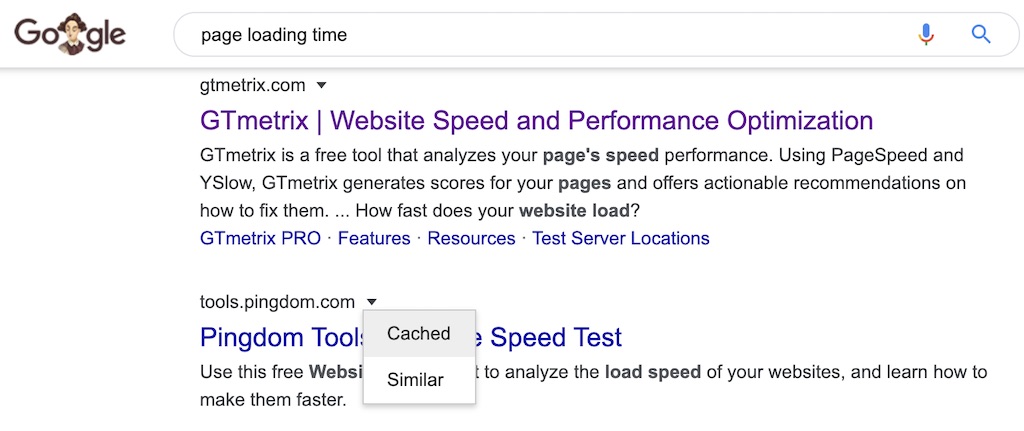
Use GTMetrix or Pingdom Tools to check the size, speed and rendering of the cached page.
Then run the cached URL through Google’s Mobile Friendly Tool and ThinkWithGoogle.com to assess the improved performance.
Use quick loading typography fonts
Not all fonts are easy or quick to load.
You want to use a font that renders well on mobile devices, but also use one that is quick to load and ideally doesn’t rely on external requests, or can be loaded from the local files on your server or from your CDN. [6]
Additionally, if you are using Google fonts, you should load them asynchronously as they are a blocking resource. Combine and load fonts asynchronously with webfont.js [8]
Also consider adding a pre-connection setting that will allow you to pre-load the fonts instead of adding wasted loading time by waiting for the fonts to be requested from the CSS file. [9, 11]
Resource: Typography and font optimization
Resource: Google Developers – Web font optimization
Resource: Pre-loading content
Use this to avoid invisible text while the page is loading.
You may want to use a subfont (like Helvetica, Arial, OpenSans) that the web browser will automatically display whilst it loads the custom font for your web page.
You can always have the system font load initially and then swap it for your custom font once the page loads. [10]
Useful tool: Google Lighthouse
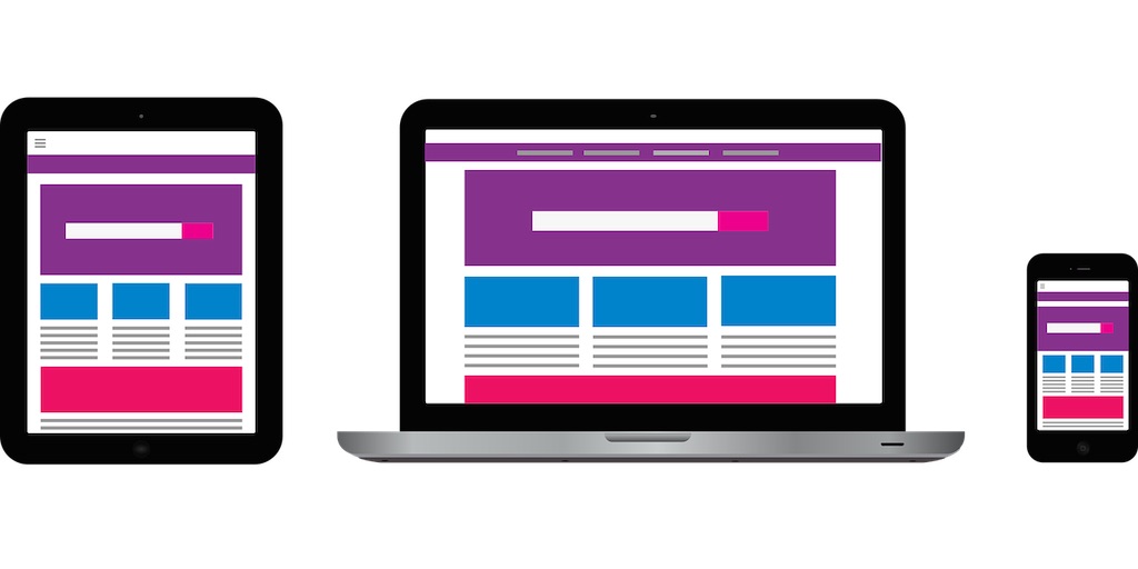
Mobile devices
You should be aware of the types of mobile devices that your consumers are using to consume your site’s content.
The mobile devices will typically be:
- Mobile phones/Smartphones
- Tablets
- Laptops
- Wearables (watches)
- Home devices (Alexa, Google Home)
Check the statistics in Google analytics or industry trends to see usage statistics by device.
Pop-ups on mobile devices
The use of interstitials (pop-ups) isn’t very liked by Google. And it can be challenging to navigate away from these on mobile devices.
There is a time and a place to use these. However, I would suggest hard coding what’s being promoted in your site’s pop-ups into the content (body tag) within your web page.
Instead of using automatic pop-ups, you may choose to instead display buttons that will trigger a pop-up if clicked on. [7]
Use a mobile-friendly Favicon
Favicons are great for the identity and branding on your site, but make sure you don’t add a favicon image that will bloat your web page’s loading time.
- Use a tool like GIMP to create the favicon file.
- Create a 16 x 16 pixel square image
- Save the favicon image as a .ico file
Loading the favicon to the site.
The fastest Favicons will load from the root directory via the cPanel. This will automatically load the Favicon for your site.
If you are using WordPress and you want to use a lightweight plugin, you can use BlueT FavIcon.
Note: If you add it as a site icon via Customizer in WordPress, it will increase in size, which will slow down the page loading speed.
Make sure a Favicon is loaded to prevent other media from being uploaded to mistakenly and bloating the size of the page.
[12]
AMP (Accelerated Mobile Pages)
Accelerated Mobile Pages use a simplified HTML (AMP HTML) to serve content quickly to mobile device users.
It is still in its early stages, however the HTML is so simple that it strips away alot of features such as rich images, CSS, and apps. [16]
If your site can use it, that’s great. We have seen from our testing that it does contribute to more visibility, conversions, and revenue.
There are some cases where migrating to AMP doesn’t fit with the goals.
So assess it on a case by case basis.
Click here to read our case study on AMP
Resource: AMP Guide (Developer’s resource)
Resource: Google AMP tester
Font size
Font size is important because the user should be able to easily read and scroll through the content.
The minimum font size you should display for mobile devices is 16 pixels. [13]
Line spacing
You also want to maximize the readability of your web text on mobile devices by utilizing line spacing that makes it easy for the reader to read and scroll.
Aim for line spacing between 140-180% of the pixel size (of even opt to start with 1.5x line spacing and then optimize the line spacing from there). [14]
Next steps
Go through your website using the list provided to see where you can make improvements. Continue to test and make improvements to the mobile version of the site so it will improve the SEO performance.
Keep track of impacts to the site’s ranking, engagement, and conversions through mobile channels.
As the site starts to get more visibility for mobile search queries, pay attention to CTR improvements that can be made in the Google Search Console.
I recommend watching the video below for a quick 60 second summary.
Let us know how you go with your mobile SEO by sharing your experience in the comments.
Thanks for reading.
References
[2] Google – Mobile First Indexing
[3] Google – Mobile analysis in PageSpeed Insights
[5] Apple Patent – Acceleration of rendering web-based content
[6] Google – Mobile-Friendliness for developers
[7] David Walsh – Font loading techniques
[8] Swift Themes – Get a 100 Page speed score for mobile and desktop
[9] Making Google Fonts faster
[11] Fastest font loading ever
[12] Fastest loading Favicon for mobile
[13] Make your font size mobile-friendly
[14] Best UX practices for line spacing
[15] Global Mobile Phone Statistics
[16] How to AMP up your content with Google Accelerated Mobile Pages (AMP)
-
 Guest Posting Services$5,500.00
 -
 PBN Services$10,000.00
 -
 White-label SEO$5,500.00
 -
 Blogging Services$5,500.00
 -
 Shopify Migration$10,000.00
 -
 WordPress AuditPrice range: $500.00 through $2,500.00
 -
Product on sale
 SEO Writing CourseOriginal price was: $5,000.00.$2,000.00Current price is: $2,000.00.
 -
 SEO Website MigrationPrice range: $5,000.00 through $40,000.00
Join the newsletter

Get updates that will allow you to grow your website's income over the next 12 months.


Pingback: Shopify Search engine marketing – BGDM